
This week the CASology Design Team will be presenting you with two card options, contrasting CAS and not-so-CAS. (Hence the cue: CONTRAST.)
We are sponsored by My Creative Classroom; I invite you to check out the details at the CASology blog....the prize offering this week is a free seat to any of their online workshop classes!
So, here are my cards. I played with a free digi image from The Alley Way Stamps in my quest to make Valentine's Day cards for Winter's "Caring Hearts Card Drive." (You can find the image HERE and the card drive details HERE.)
First up -- the not-so-CAS version.

Notice this not-so-CAS version has lots of layers of paper and several embellishments (button, jute, rhinestone, Glossy Accents)?

Here is my revised card in a CAS style -- lots of white space, minimal layers and embellishments.

Can you tell the difference? Here they are together...

I prefer the CAS card myself...definitely more within my comfort zone!
Note that you are not required to make two cards for the challenge this week. Maybe you'd like to CAS-ify a card you previously made that wasn't so CAS? I look forward to seeing where you take this cue!
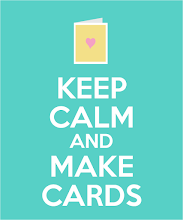
Here is a reminder of how we define Clean And Simple at the CASology blog:
Keep these things in mind when creating a CAS design:
1. One main image
2. Lots of open space (uncluttered)
3. Limited layers & embellishments
4. Quick & easy to recreate
Check out the Design Team and our amazingly talented Guest Designer for some ideas along the way; you have until 4PM on Sunday to link up for this challenge. I hope you get a chance to play along!

Guest Designer: Amy
Thanks for visiting...I do appreciate it!
Judy


Great idea to photograph them together - it makes the difference crystal clear. Both wonderful cards, but one definitely more CAS than the other!
ReplyDeleteLove both of these, Judy! :) So cute and sweet!
ReplyDeleteWonderful cards.. love both of them :)
ReplyDeletefab set of cards, judy... you showcased the cue word perfectly with your cards!!
ReplyDeletePerfect recreation of the same card!!
ReplyDeleteI love both they are cute!!
Love what you have done with the two cards Judy, they are both fab
ReplyDeleteI actually liked both! Love that cup of hot chocolate/tea! Hope you aren't snowed in tomorrow!
ReplyDeleteThe DT totally rocked his cue card! I'm in love with these Judy! A perfect CAS vs nonCAS!
ReplyDeletelovelovelove them both!
ReplyDeleteThese are both really wonderful, and it is great to see them side by side to see the differences. I have to admit to a slight preference for the more CAS version, but I think it's just because that is how I roll.
ReplyDeleteJudy I really like both of your cards, but the second is definitely more CAS than the first. Love the dp!
ReplyDeleteThank you so much for walking us through this week's cue card! I love both of your cards, and can really appreciate the beauty of a true CAS design in your 2nd card!
ReplyDeleteLovely cards Judy. Both of them are fabulous! :)
ReplyDeleteI really love this week's cue! It's a great reminder about what makes a good CAS design:). And you have always been a great CAS role model for me! Not that your first card isn't delightful but there's just something about the the uncluttered design of the second that's so appealing!
ReplyDeleteSorry I didn't get around here last week. This is a fabulous contrat here and I really like both cards. The small strip of patterned paper on the second card is perfect - just the right amount of pattern and colour!
ReplyDelete